Introduction
Choosing the perfect color palette for your home is one of the most powerful ways to influence the mood, comfort, and overall style of your space. Whether you’re designing a single room or refreshing your entire home, the colors you select have the ability to express your personality while creating harmony throughout your environment. In this article, we’ll walk you through how to choose the ideal color scheme for your home, step by step. Even if you are not a professional designer, you will be able to make confident decisions that will transform your space and bring out its best features.
Understand the Fundamentals of Color Theory
Before diving into choosing colors, it is essential to understand some basic principles of color theory. Knowing how colors interact with each other will help you create visually appealing and balanced combinations.
- Primary Colors: Red, blue, and yellow are the primary colors from which all other colors are derived.
- Secondary Colors: Green, orange, and purple are created by mixing the primary colors.
- Tertiary Colors: These are formed by mixing a primary color with a secondary color.
Understanding these color relationships will enable you to choose combinations that are harmonious and create a pleasing aesthetic in your home.
Start with a Base: Your Anchor Color
Every successful color palette needs a strong foundation. The base color you choose will appear in larger areas, such as walls, ceilings, floors, or key furniture pieces. It should be a neutral tone that allows other colors to shine without overwhelming the space.
Some popular base colors include:
- White or off-white: Fresh, flexible, and timeless.
- Light gray: Modern, serene, and calming.
- Beige or taupe: Warm and classic, offering a sense of comfort.
- Greige: A sophisticated blend of gray and beige that complements a wide range of other colors.
This base color will act as your canvas, setting the tone for the rest of the palette.
Create the Desired Mood: What Atmosphere Do You Want?
Colors have a direct influence on how a room feels. Before making your choice, ask yourself: What emotion or atmosphere do I want this space to convey?
Here are some general color moods and the types of color schemes that best evoke these feelings:
- Calm and Serene: Soft blues, greens, lavenders.
- Warm and Cozy: Earth tones, deep reds, mustard yellows.
- Bright and Energizing: Yellows, oranges, bold pinks.
- Sophisticated and Modern: Grays, navy blues, charcoal tones.
Think about how you want to feel in each space and choose colors accordingly. It’s important to match the mood you want to create with the activities that typically occur in that room.
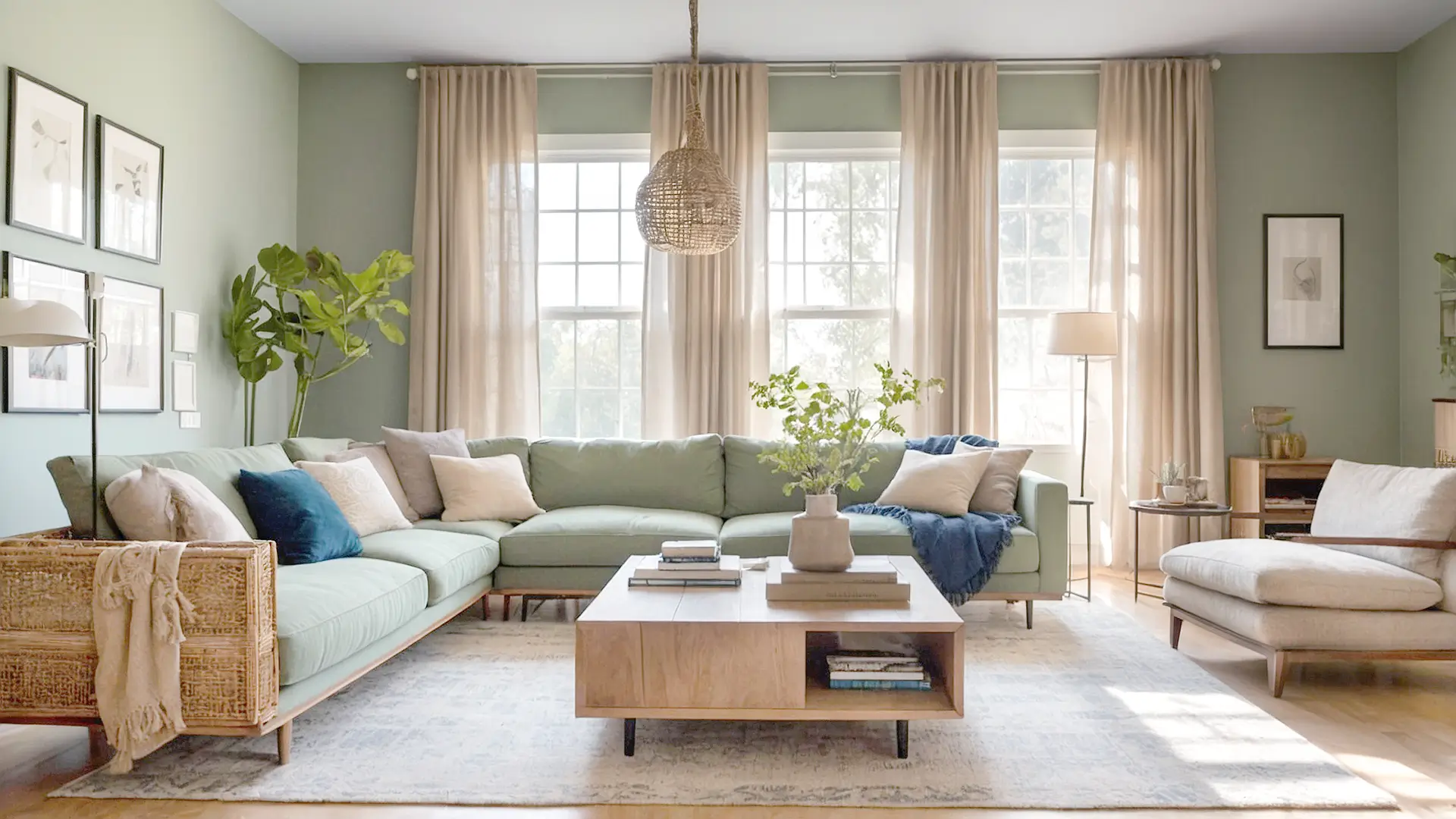
Apply the 60-30-10 Rule
A simple yet effective guideline for color distribution is the 60-30-10 Rule. This rule helps maintain balance in the room, ensuring one color is dominant, while secondary and accent colors add depth and interest.
Here’s how to apply the rule:
- 60%: The dominant color, typically used on walls or larger furniture pieces.
- 30%: The secondary color, found in elements like curtains, rugs, bedding, and larger accent pieces.
- 10%: The accent color, often seen in smaller decor items like throw pillows, artwork, or lamps.
This formula guarantees a cohesive and balanced design, allowing each color to be prominent without clashing.
Consider Natural Light and Room Size
Lighting is a key factor in how colors appear. Different lighting conditions throughout the day can change the look of a color, so it’s important to account for both natural and artificial light.
- North-Facing Rooms: These rooms tend to have cooler, dimmer light, so opt for warm undertones to balance the chill.
- South-Facing Rooms: These rooms enjoy bright, consistent light, allowing almost any color to work well.
- Small Spaces: Use light, reflective colors to make small rooms feel bigger and more open.
- Large Rooms: Don’t shy away from using deeper, bolder shades to bring warmth and intimacy to larger spaces.
Always test the paint samples on actual walls before committing. Lighting can make a huge difference in how a color looks at different times of the day.
Build Around Existing Elements in Your Space
If you’re not starting from scratch, it’s important to incorporate the elements you already have in your space. Whether it’s flooring, countertops, furniture, or even artwork, these pieces can serve as inspiration for your new palette.
- Pull inspiration from existing patterns found in rugs, upholstery, or curtains.
- Use colors from natural elements, such as plants or artwork you already love.
- Incorporate wood tones, metals, or textiles that dominate the space to make your color choices feel cohesive.
A palette that complements existing elements will naturally feel more integrated and cohesive, making the space more inviting and comfortable.
Choose Your Color Scheme Type
There are several classic types of color schemes you can base your palette around, depending on your aesthetic preferences. Each scheme offers a different dynamic and energy to a space.
- Monochromatic: This scheme uses variations of one color in different shades and tints. It’s elegant and simple but can feel flat if not layered with textures or patterns.
- Analogous: This scheme uses 2-3 colors that are next to each other on the color wheel. It creates a natural and harmonious look, perfect for cozy spaces.
- Complementary: This uses colors that are opposite each other on the wheel (e.g., blue and orange). It offers high contrast and vibrant energy, great for bold rooms.
- Triadic: This scheme uses three evenly spaced colors on the wheel (e.g., red, yellow, blue). It’s balanced and colorful, perfect for creative or playful spaces.
Pick the scheme that best suits your personality and the vibe you want to create in the room.
Test Before You Commit
Never base your final decision solely on a color swatch from the store. It’s crucial to test the color in the space itself to see how it reacts with the lighting in your home. A color that looks great in the store can appear completely different when painted on the walls of your room.
If you’re unsure about a color, start small by testing it in a hallway, bathroom, or on an accent wall. This will give you a clearer idea of how it will look in the context of your room.
Don’t Forget the Ceiling and Trim
When planning your color palette, many people overlook the ceiling, trim, and doors. These elements can either blend in with the rest of the room or provide an opportunity for contrast and added interest.
- Ceilings: A white ceiling can make a room feel taller and more open, while bold ceiling colors can make a dramatic statement.
- Trims: White trim is classic and timeless, but adding color to trim can modernize a space and make it feel more personalized.
By paying attention to these smaller elements, you can elevate the overall design and create a more polished, well-rounded space.
Final Tips for a Cohesive and Polished Look
To ensure your color palette works throughout your home, keep the following tips in mind:
- Repeat colors: Use colors from your palette in different rooms to create a sense of flow between spaces.
- Layer colors: Incorporate colors in different textures, such as on walls, furniture, fabrics, and accents to add depth and richness.
- Limit your color choices: Stick to 3-5 main colors per room to avoid a chaotic or overwhelming feel.
- Stay true to your personal style: Don’t feel pressured to follow trends—make choices that reflect your personality and preferences.
Bring Your Vision to Life
Choosing the right color palette doesn’t have to be overwhelming. With a little planning and a thoughtful approach, you can use color to transform your home into a space that feels truly your own. Whether you want a cozy neutral feel or a vibrant contrast, the key is balance, flow, and personalization.
Take your time, test your choices, and, most importantly—have fun turning your house into a home you’ll love for years to come.