Introduction
Color is one of the most powerful tools in interior design. It has the ability to shape the atmosphere of a room, influence our emotions, and even affect our behavior. From creating a calm retreat to evoking energy, the right color palette can completely transform a space. Whether you are designing a living room, bedroom, kitchen, or office, understanding how to use color effectively is essential for creating the mood and ambiance you desire.
In this article, we’ll explore how to use color strategically to create the perfect mood in your home. We’ll dive into color psychology, provide practical tips for selecting the right hues, and share how to incorporate color into various areas of your home to enhance your living experience.
1. Understanding Color Psychology
Before diving into specific color choices, it’s important to understand the psychology behind colors. Each color has a psychological effect on our mood and emotions, which can vary depending on the context and intensity of the color.
Warm Colors
Warm colors, such as red, orange, yellow, and shades of pink, are known to stimulate energy, warmth, and excitement. These colors are often used to create lively, inviting spaces. However, they can also evoke feelings of intensity and passion if used excessively, so balance is key.
- Red: A color that evokes passion, energy, and action. It can make a room feel more energetic and intense, but too much red may be overwhelming.
- Orange: A vibrant, cheerful color associated with creativity and enthusiasm. It is often used in spaces where social interaction and conversation are encouraged.
- Yellow: A warm, optimistic color that promotes happiness and positivity. It’s a great choice for kitchens or areas where you want to create a welcoming, lively atmosphere.
- Pink: Soft pinks can evoke a sense of calm and warmth, while brighter shades can add playfulness and fun.
Cool Colors
Cool colors, such as blue, green, purple, and shades of gray, have a calming and soothing effect. These colors are ideal for creating spaces where relaxation and peace are the priority.
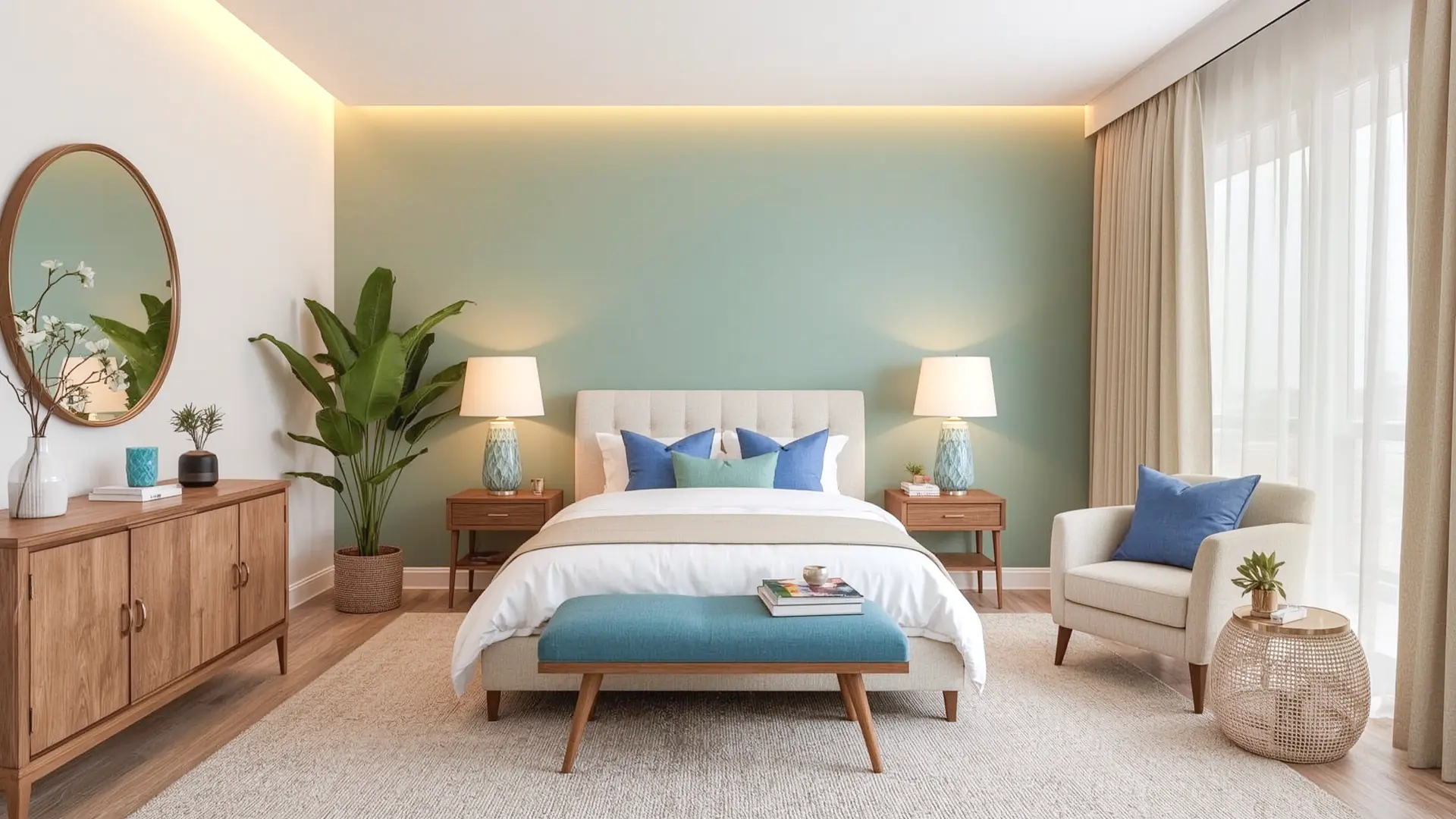
- Blue: Often associated with calm, tranquility, and stability, blue is an excellent choice for bedrooms, bathrooms, or any space where you want to unwind.
- Green: A color that connects us to nature, green is refreshing and relaxing. It can reduce stress and create a balanced, harmonious atmosphere in living rooms, home offices, or bedrooms.
- Purple: A rich, luxurious color that can evoke creativity and inspiration. Lighter purples like lavender are calming, while deeper purples like plum add elegance and sophistication.
- Gray: A neutral color that can create a sophisticated, timeless look. Depending on the shade, gray can be calming and soothing or add a sense of quiet elegance to a space.
Neutral Colors
Neutrals, such as white, beige, brown, and black, serve as a backdrop for other colors and can balance and complement bolder hues. They are often used to create understated elegance and can be easily paired with any color palette.
- White: Clean, fresh, and versatile, white can create a bright and airy atmosphere, making a space feel larger and more open.
- Beige: A warm neutral that brings a sense of calm and comfort. It’s an excellent base color for creating a cozy, inviting atmosphere.
- Brown: Earthy and grounding, brown adds warmth and richness to a space. It pairs well with natural materials and works well in rustic or farmhouse-style designs.
- Black: Bold and dramatic, black can add sophistication and a sense of luxury to a room. It’s perfect for creating contrast and drawing attention to certain areas.
2. Creating Different Moods with Color
Now that we understand the basic effects of different colors, let’s explore how to use them to create specific moods in your home.
Relaxing and Calming Spaces
If you want to create a peaceful and calming environment, opt for cool and neutral tones. Soft blues, greens, and grays are perfect for bedrooms or spaces where relaxation is key. These colors help to reduce stress and promote restful sleep.
- Best Colors for Calm Spaces: Soft blues, pastel greens, light grays, lavender.
How to Use Them: Use cool colors for walls, bedding, and furniture. Combine with white or neutral tones for a clean and calming effect. Add plants or natural elements for additional relaxation.
Energizing and Inviting Spaces
For areas where you want to inspire energy and creativity—such as a home office, kitchen, or living room—warm tones like red, orange, and yellow work best. These colors stimulate the senses, making the room feel lively and full of energy.
- Best Colors for Energizing Spaces: Bright yellow, red accents, orange, vibrant pink.
How to Use Them: Use warm colors as accent walls or in areas where you entertain. Incorporate them in pillows, artwork, or small furniture pieces. Be mindful of overusing these colors, as they can feel overwhelming if applied to large surfaces.
Cozy and Comfortable Spaces
To create a space that feels warm and inviting, go for earthy tones like deep browns, rich greens, and warm neutrals. These colors bring a sense of comfort and hominess, making them ideal for living rooms, dens, or reading nooks.
- Best Colors for Cozy Spaces: Warm beige, rich brown, olive green, terracotta.
How to Use Them: Use earthy tones for furniture, rugs, and walls. Add texture with fabrics like wool, linen, or velvet to enhance the cozy feel. Combine these tones with soft lighting to create a welcoming, intimate atmosphere.
Modern and Sophisticated Spaces
For a more modern or sophisticated feel, incorporate sleek neutrals like gray, black, and white with metallic accents such as gold, silver, or copper. This color scheme works well in contemporary spaces where elegance and refinement are the goals.
- Best Colors for Sophisticated Spaces: Charcoal gray, black, white, metallics.
How to Use Them: Use neutral tones for larger furniture and walls, and introduce metallics through lighting, accessories, or artwork. Keep the space minimal to emphasize clean lines and elegant design.
3. Mixing and Matching Colors
The key to using color successfully is knowing how to mix and match it within a space. A well-thought-out color scheme can tie the room together and enhance the overall design. Here are some strategies to help you create the perfect color harmony in your home.
The 60-30-10 Rule
One of the most popular strategies for mixing colors is the 60-30-10 rule. This rule suggests using three colors in a room:
- 60% should be your primary color (walls, large furniture).
- 30% should be your secondary color (accent furniture, rugs, curtains).
- 10% should be your accent color (pillows, artwork, decorative accessories).
This rule ensures a balanced and cohesive color scheme without overwhelming the space with too many hues.
Use of Contrasting Colors
To create visual interest and depth, you can pair contrasting colors. For example, combining warm and cool colors, like navy blue and mustard yellow, can create a striking yet harmonious look.
Accent Walls and Features
An accent wall is a great way to introduce bold or contrasting colors without overwhelming the room. Use an accent wall in a deeper tone, like dark green or deep blue, to create a focal point. Similarly, contrast colors in smaller features such as throw pillows, vases, or artwork to add balance and drama.
4. Consider Lighting and Natural Light
Lighting plays a significant role in how colors appear in a room. A color can look entirely different under warm, soft light compared to cool, bright lighting. Always consider the lighting in your space when choosing colors.
Natural Light:
Colors appear lighter and brighter in natural light, so bold shades may feel more vibrant during the day. Opt for softer, lighter hues if you want a more serene look.
Artificial Lighting:
Warm-toned lights can make colors like red and orange appear more inviting, while cool-toned lights can make blues and greens feel more refreshing. Choose the appropriate lighting to enhance the colors in your room.
Always test your color choices with the lighting you plan to use in the room to ensure that the final result aligns with the mood you want to create.
Conclusion
Color is one of the most powerful design tools at your disposal. By understanding the psychological effects of different colors and strategically incorporating them into your home, you can create a space that reflects your personality and enhances the mood you want to set. Whether you’re creating a relaxing retreat, a vibrant gathering place, or a cozy sanctuary, color can help you transform any room into a place you love to be. Don’t be afraid to experiment and mix different hues to find the perfect color scheme for your home.